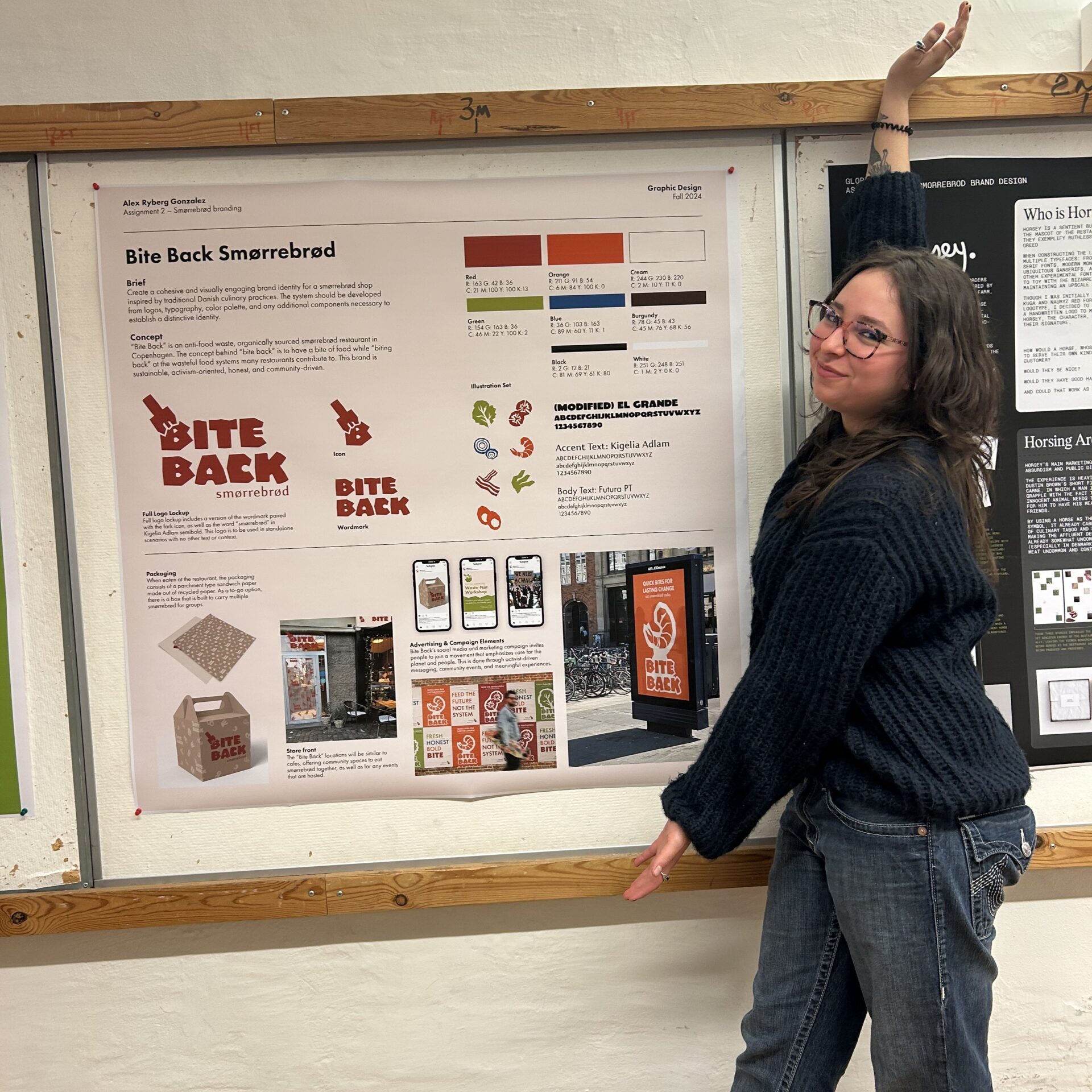
Smørrebrod Brand Identity
The main objective of this project was to create a cohesive and visually engaging brand identity for a smørrebrød shop inspired by traditional Danish culinary practices. The system should be developed from logos, typography, color palette, and any additional components necessary to establish a distinctive identity.
Roles: Illustrator, Writer, Designer, Animator
Concept
“Bite Back” is an anti-food waste, organically sourced smørrebrød restaurant in Copenhagen. The concept behind “bite back” is to have a bite of food while “biting back” at the wasteful food systems many restaurants contribute to. This brand is sustainable, activism-oriented, honest, and community-driven.
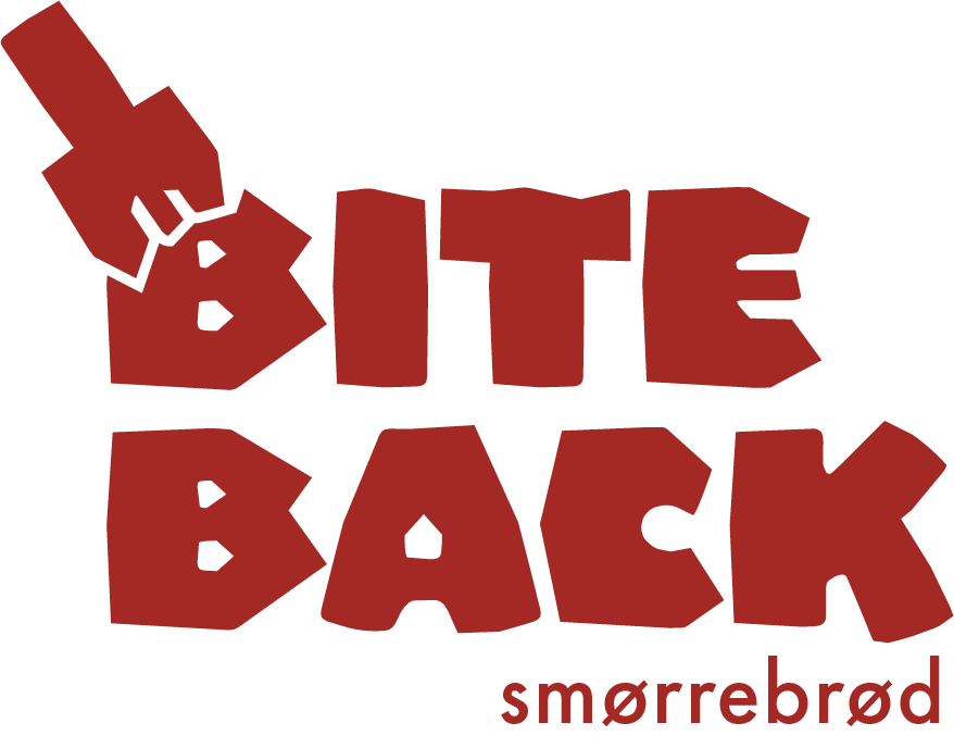
The System
From colors and typography, to the development of a logo system and illustration set, the brand identity grew quickly.


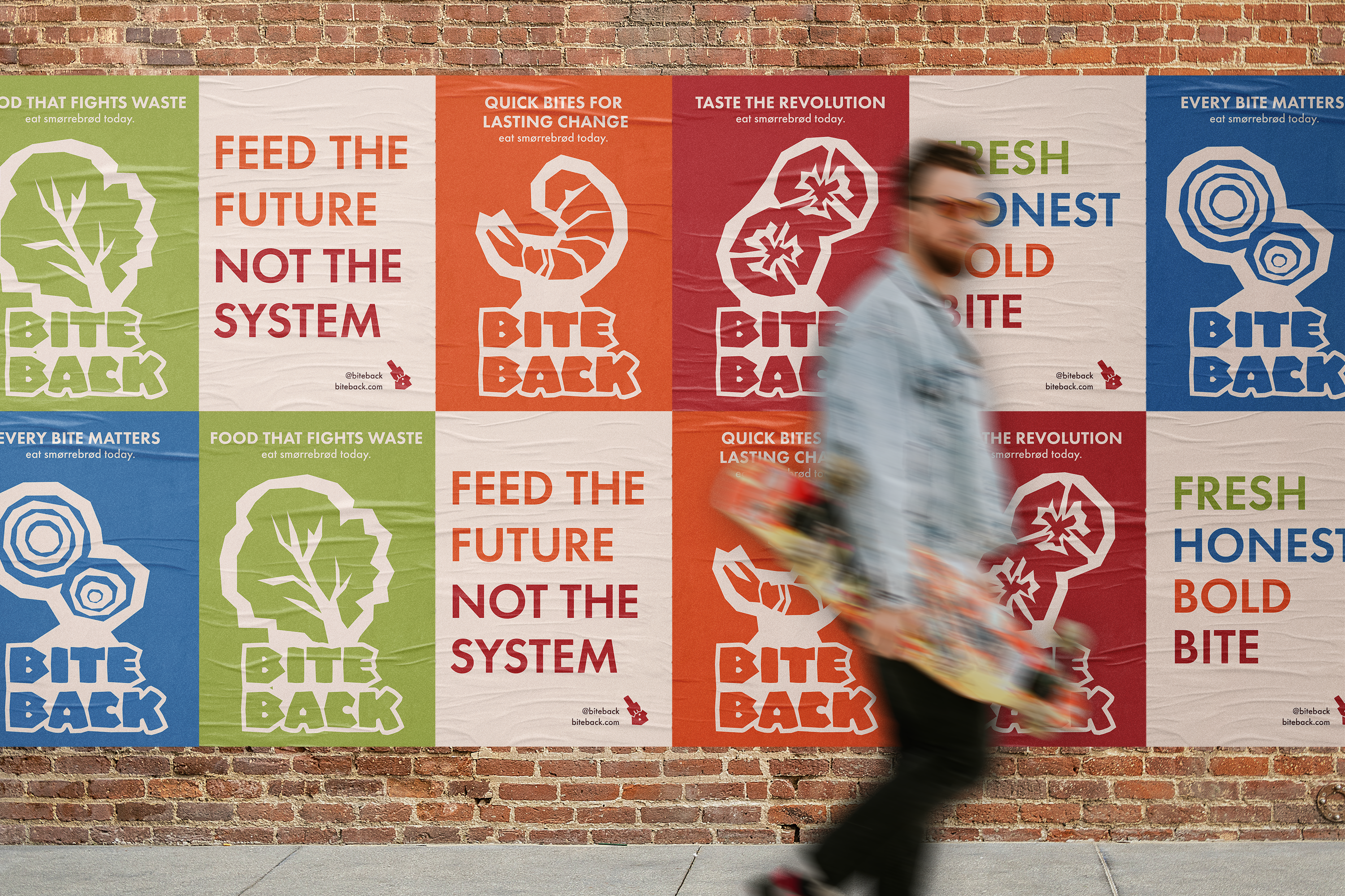
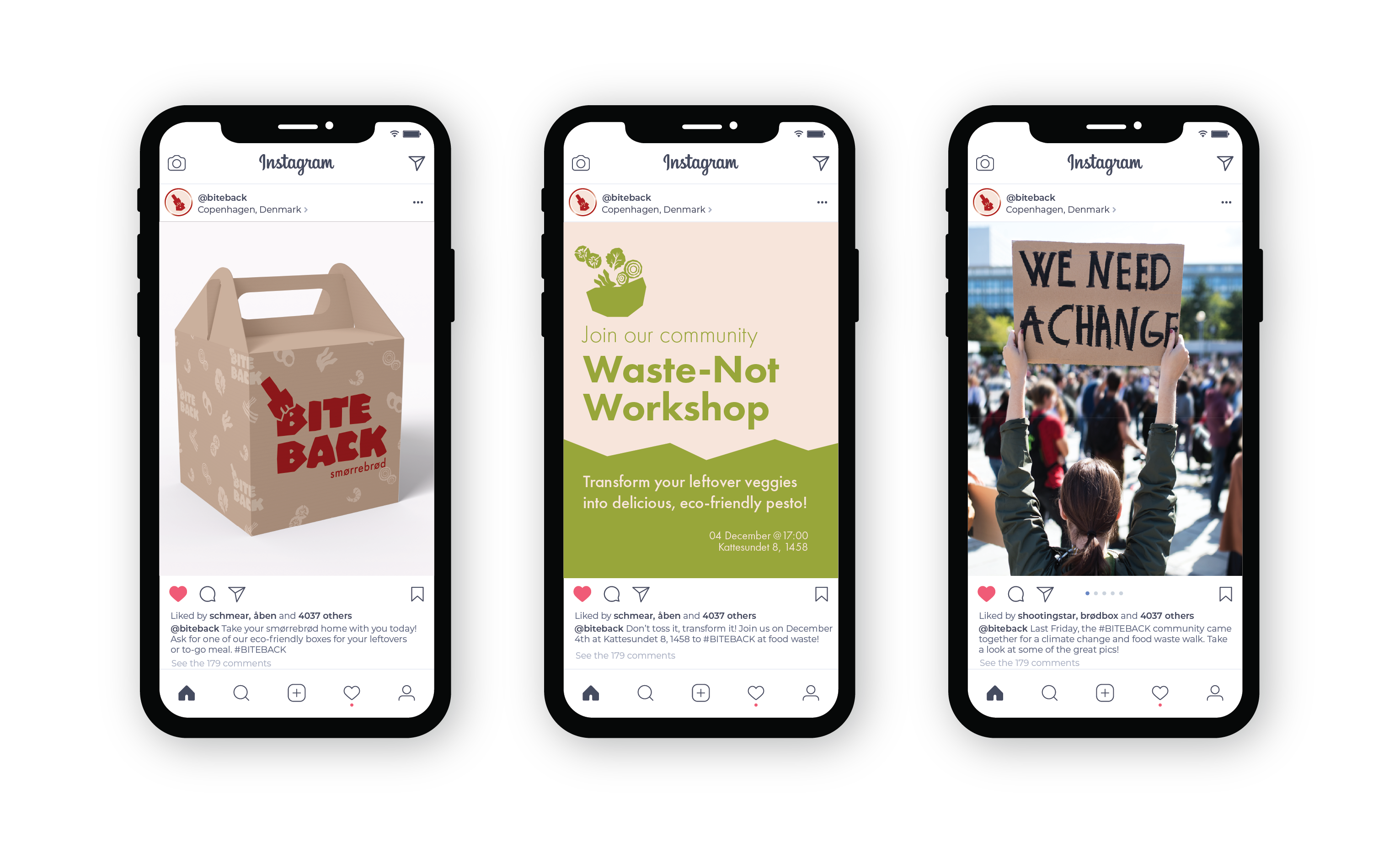
Advertising and Campaign Elements
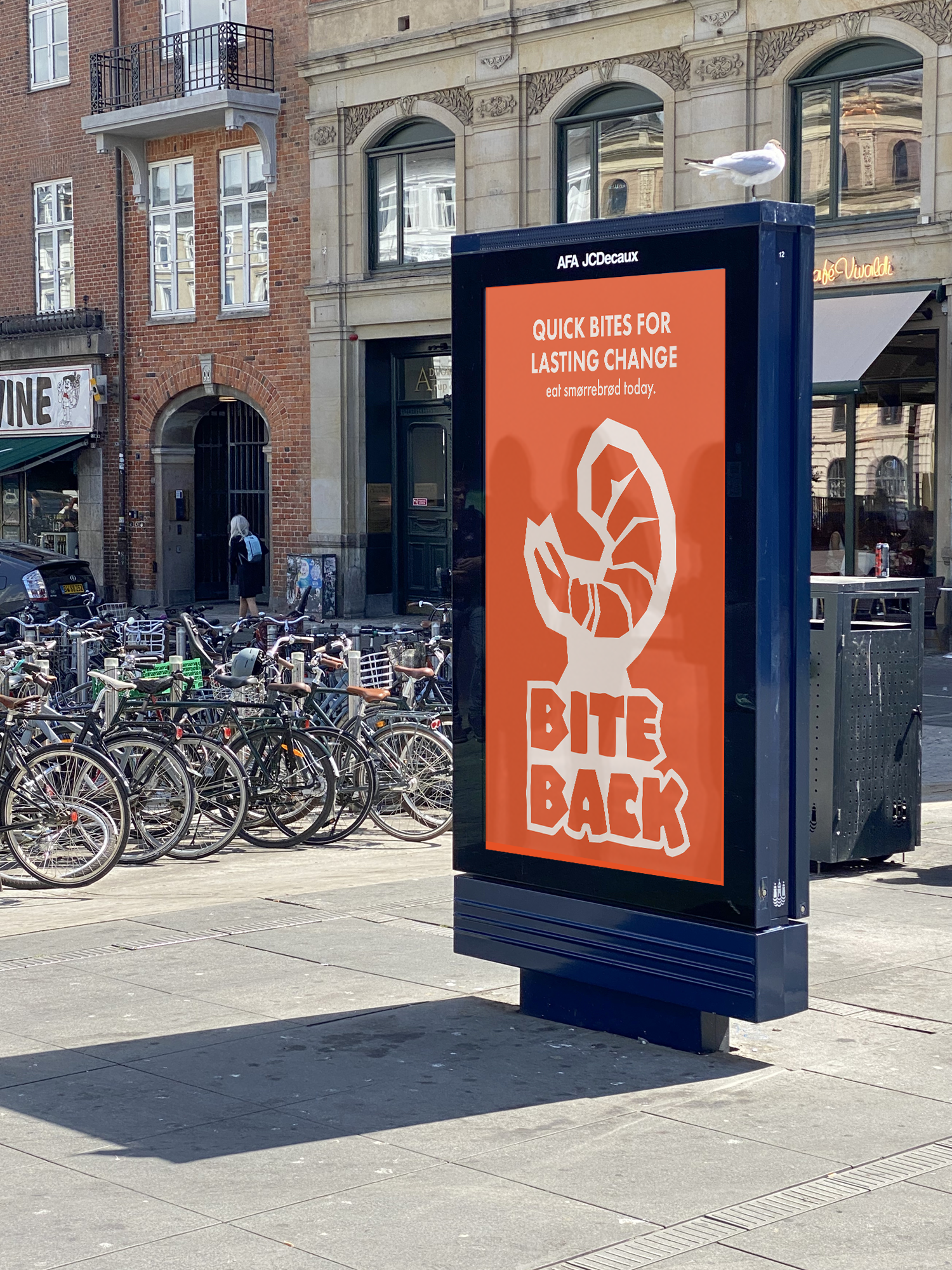
Bite Back’s social media and marketing campaign invites people to join a movement that emphasizes care for the planet and people. This is done through activist-driven messaging, community events, and meaningful experiences.
Packaging
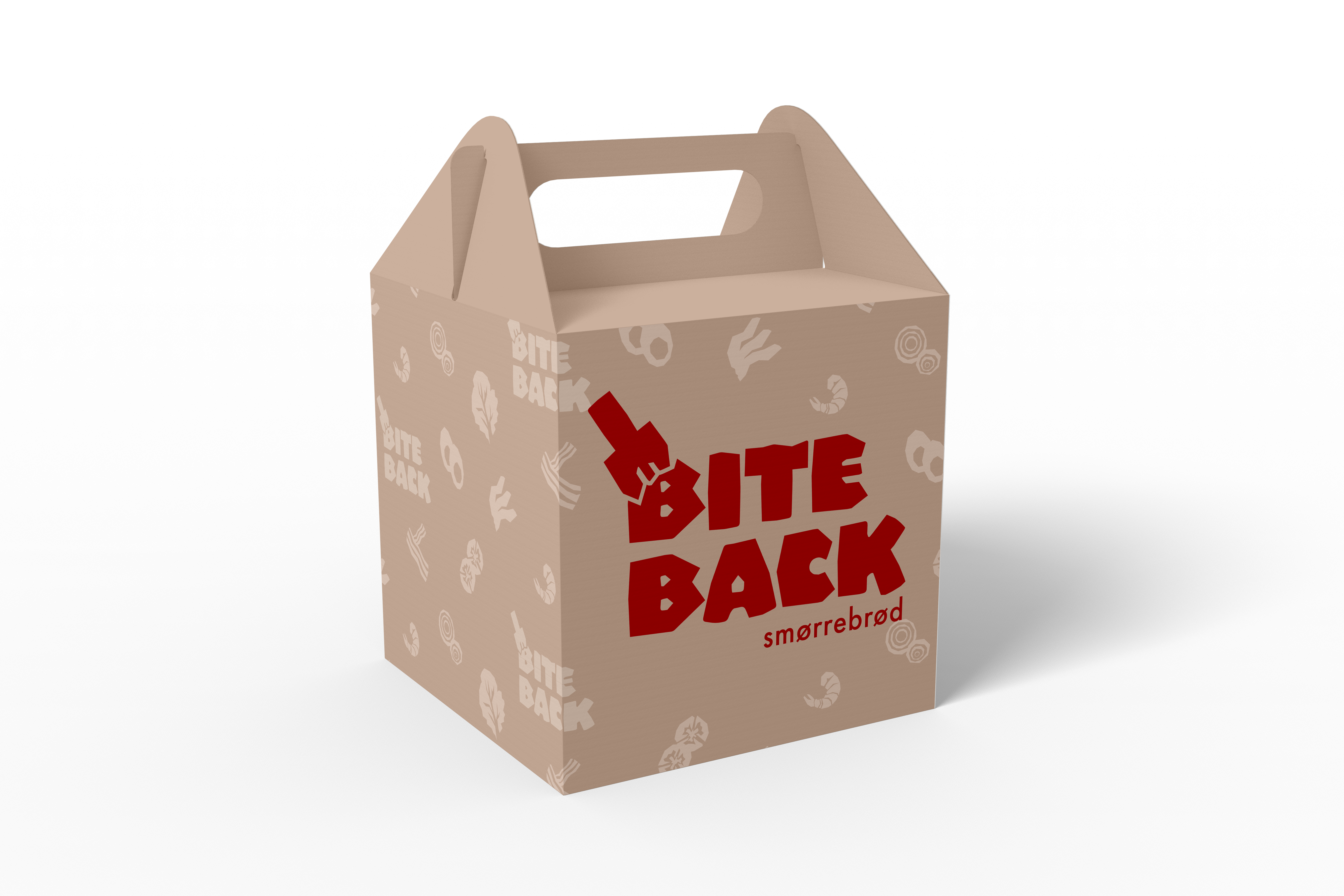
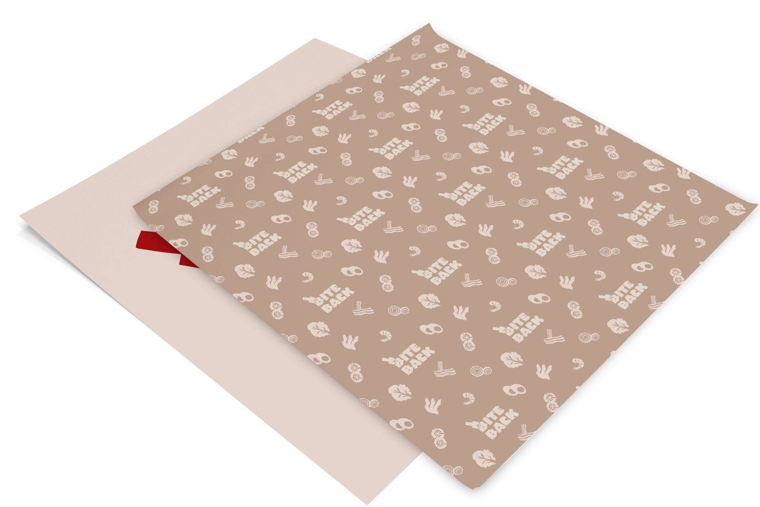
When eaten at the restaurant, the packaging consists of a parchment type sandwich paper made out of recycled paper. As a to-go option, there is a box that is built to carry multiple smørrebrød for groups.
Animations
IRL: In the Studio
This project was one of the projects I worked on and presented in Copenhagen during my semester abroad in Fall 2024.
One of my favorite parts about being abroad was getting to learn all about a culture different from my own. With this project that is all about a traditional Danish dish, it really allowed me to dive deep into what the Danes love the most. Through plenty of research -- starting with eating smørrebrod -- I developed this idea.
Since the presentation day, I have made some revisions to this project that are not present in the picture to the right.
